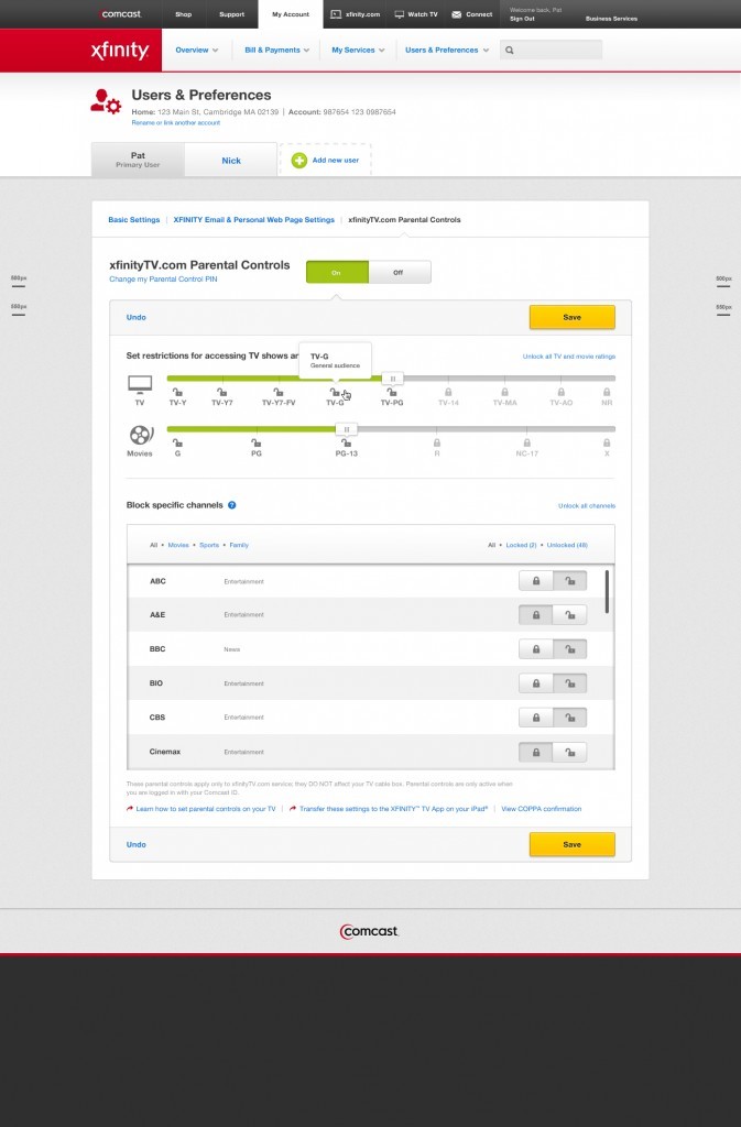
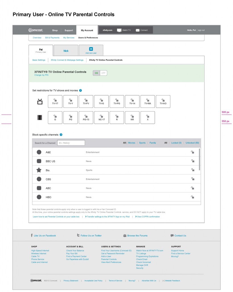
As part of a complete overhaul of Comcast’s web presence the redesign of the customer account management portal was a critical part of Comcast’s vision. When exploring the layouts and features of this site it was critical for our design team keep a keen eye on the demanding business requirements of our client this meant bringing the bill pay and account monitoring features to the forefront. Through user research and competitive analysis we were able to establish a solid structure that we later matched up with the existing site IA.
Highlights
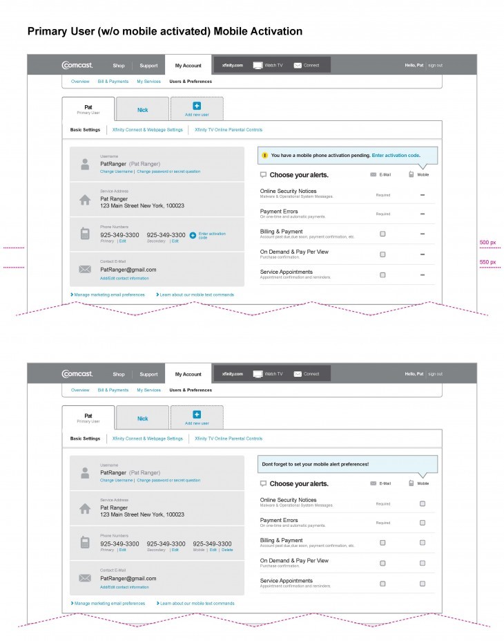
- Because of the complexity of the IA and backend systems the site had be be designed to roll out in phases. Each phase tackled different feature sets. My responsibilities mostly involved the incorporation of the account activity alert system site-wide.
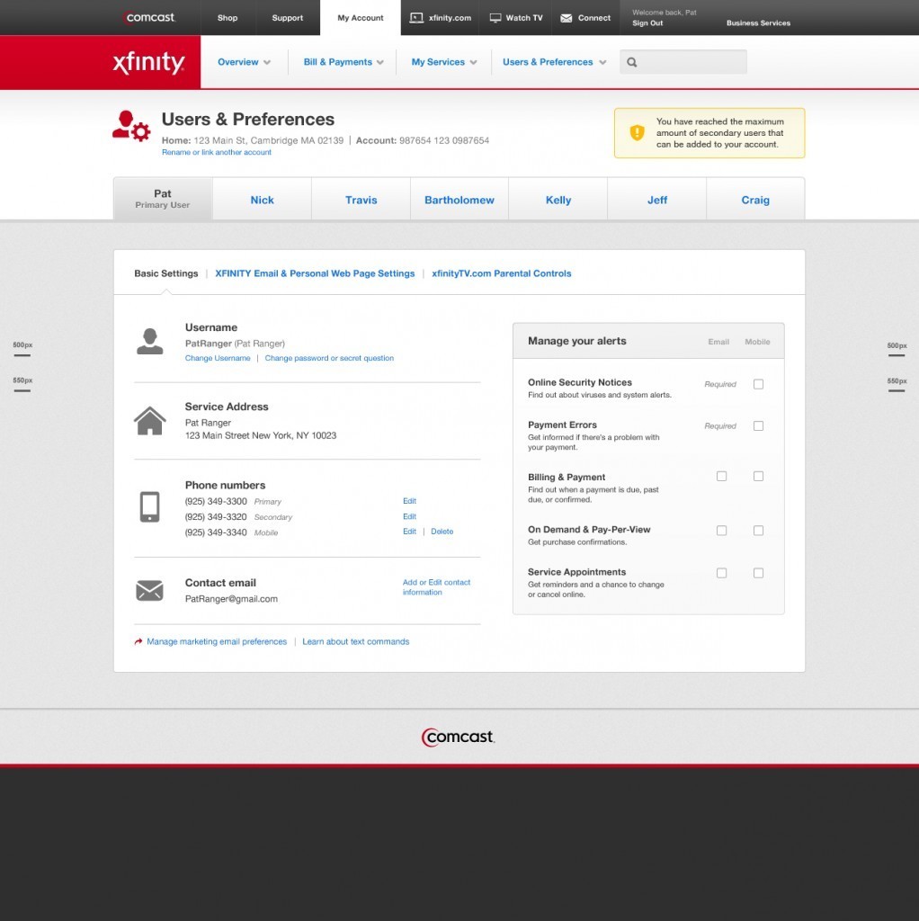
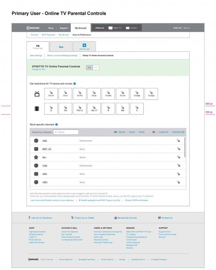
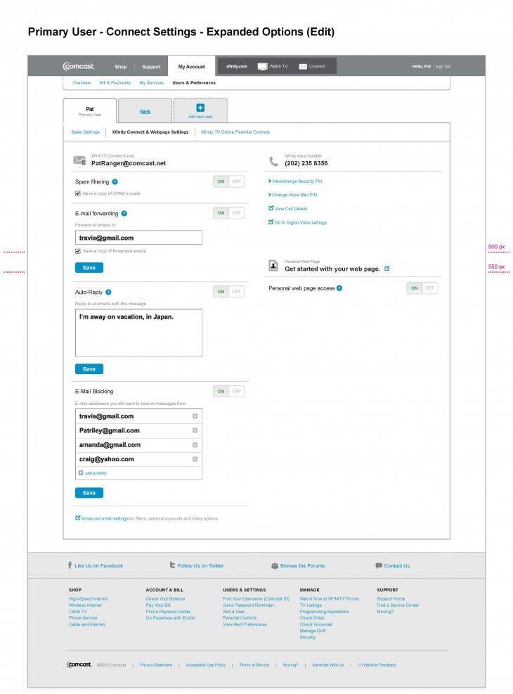
- During the later phases of the design I was tasked with the design and incorporation of the User Settings section of the site.
Working on this section of the site was a perfect fit for me because I really love solving complex problems .By understanding the underlying IA and limitations of the back end systems I started to work my way at the knots in the UI. The design relocates and adjusts information into cognitive ‘buckets’ that allow users to instinctively locate and manage their settings.

