This redesign was unique.
I was not the lead UX designer from inception, I joined the project towards the end. We had several workshops and joint design session with a very dedicated client and because the build was in-house at Fossil therefore we were able to shape content delivery.
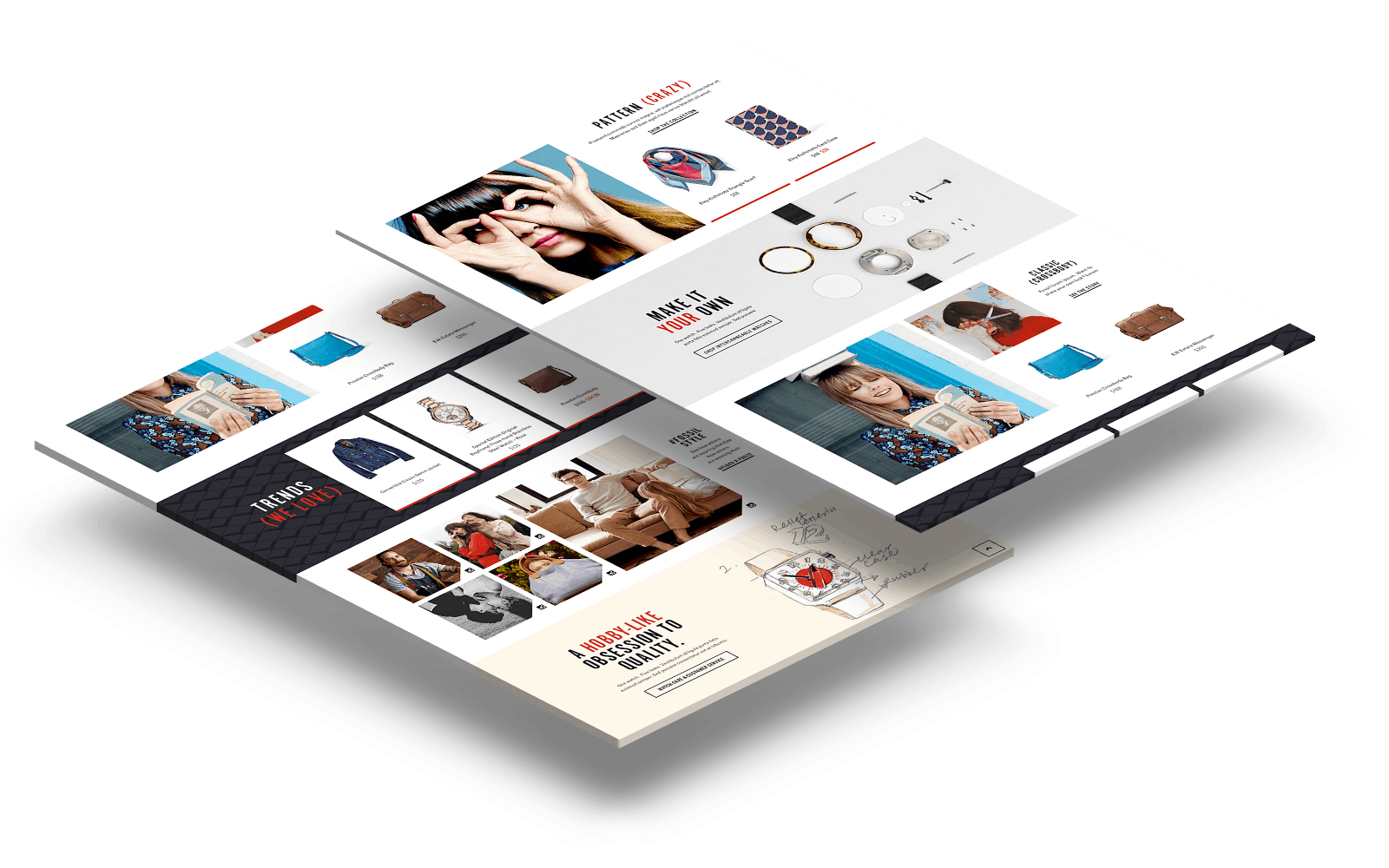
Modular kit of parts approach
In order to provide the client maximum flexibility for content the design team focused on standardizing a component kit that, tied together tightly with a new visual brand language. With core rules on design established this allowed for content deliver to be controlled and creative.

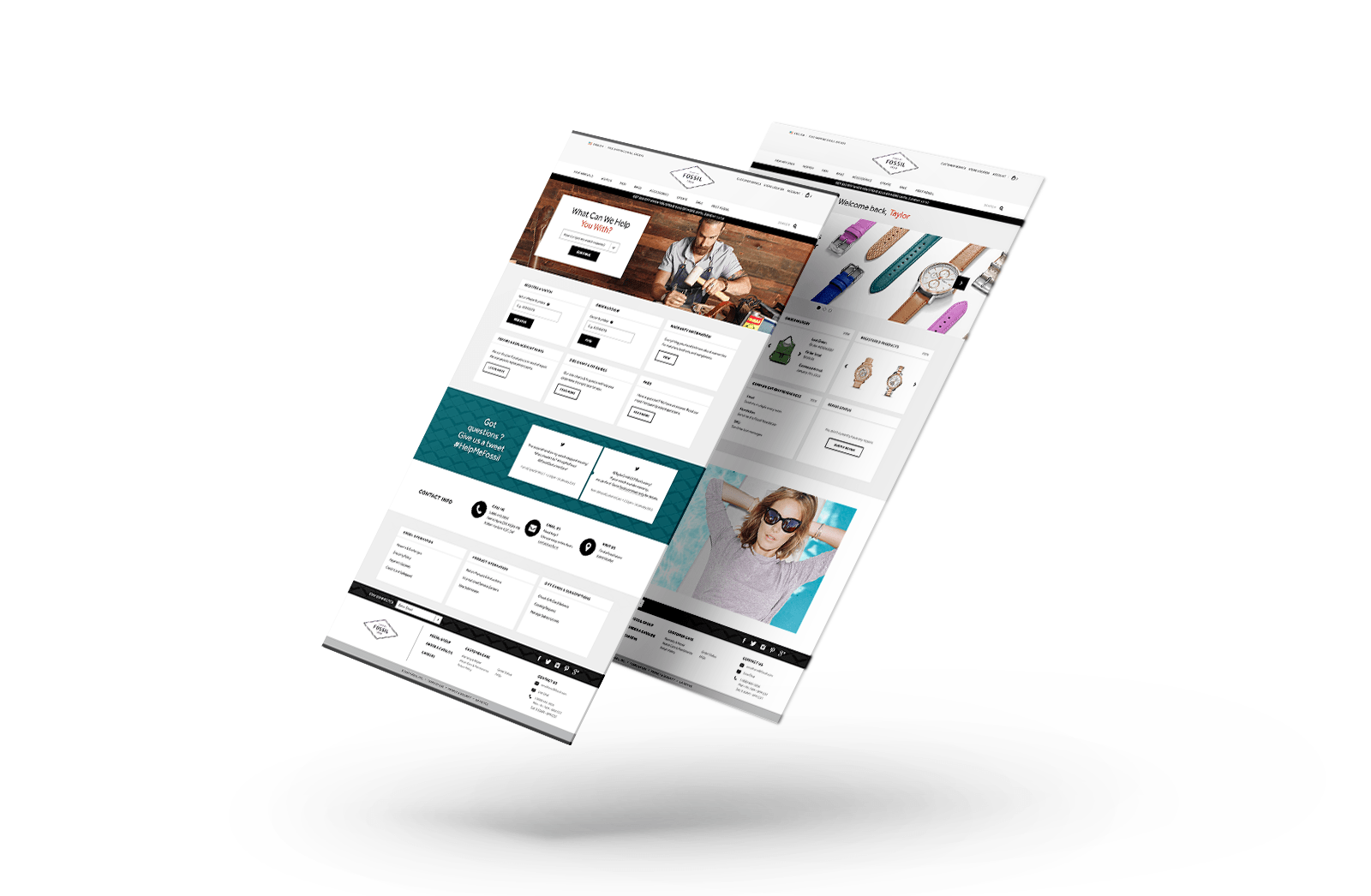
A big part of Fossil’s brand is their superior customer support. In order extend this support to their online presence we designed a robust account section on Fossil.com.

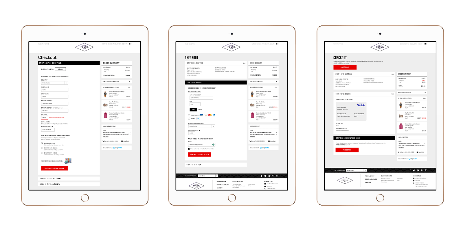
Let’s not forget, Checkout.
Keep it simple is the main rule when creating a checkout experience. At Fluid we have nailed down the science of a smooth checkout experience, plus its RWD.

